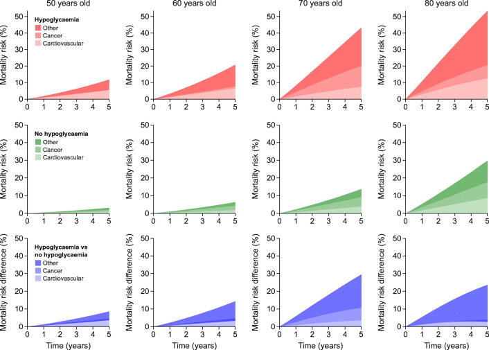
Fig. 2.
Cause-specific mortality over 5 years. Adjusted probabilities of cause-specific death are shown for 5 years of follow-up for different ages, in subjects with (red) and without (green) hypoglycaemia; the differences in the probabilities are shown in blue. In each panel, the transparency of the colour indicates the cause of death: from bottom to top, most transparent, cardiovascular; middle transparency, cancer; least transparent, other causes. As the probabilities are stacked, the overall area indicates the probability of all-cause mortality

