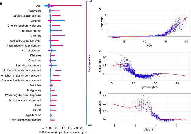
Fig. 1. Summary and feature-specific SHAP values for the baseline model.
a A summary plot of the SHAP values for each feature. Going from top to bottom, features are ordered by their overall importance in creating the final prediction (sum of SHAP values). In each feature (line), every point is a specific case (individual), with colors ranging from red (high values of the predictor) to blue (low values of the predictor). Gray points signal missing values. The point’s location on the X-axis represents the SHAP value—the effect the variable had on the prediction in this specific individual, with points further to the right marking that for that individual this covariate contributed to increasing of the risk and points to the left indicate that the covariate contributed to decreasing the risk. The vertical line in the middle represents no change in risk. b A plot of the odds ratio for different values of age. A smoothed red line is fit to the curve and a horizontal gray line is drawn at odds ratio = 1. c A plot of the odds ratio for different values of percent of lymphocytes in the blood. A smoothed red line is fit to the curve and a horizontal gray line is drawn at odds ratio = 1. d A plot of the odds ratio for different values of albumin. A smoothed red line is fit to the curve and a horizontal gray line is drawn at odds ratio = 1. a is based on the training set of the baseline population, n = 625,500 unique patients. b–d use a random sample of patients from this same population, n = 10,000 unique patients. SHAP SHapley Additive exPlanations, HDL high-density lipoprotein, COPD chronic obstructive pulmonary disease.

