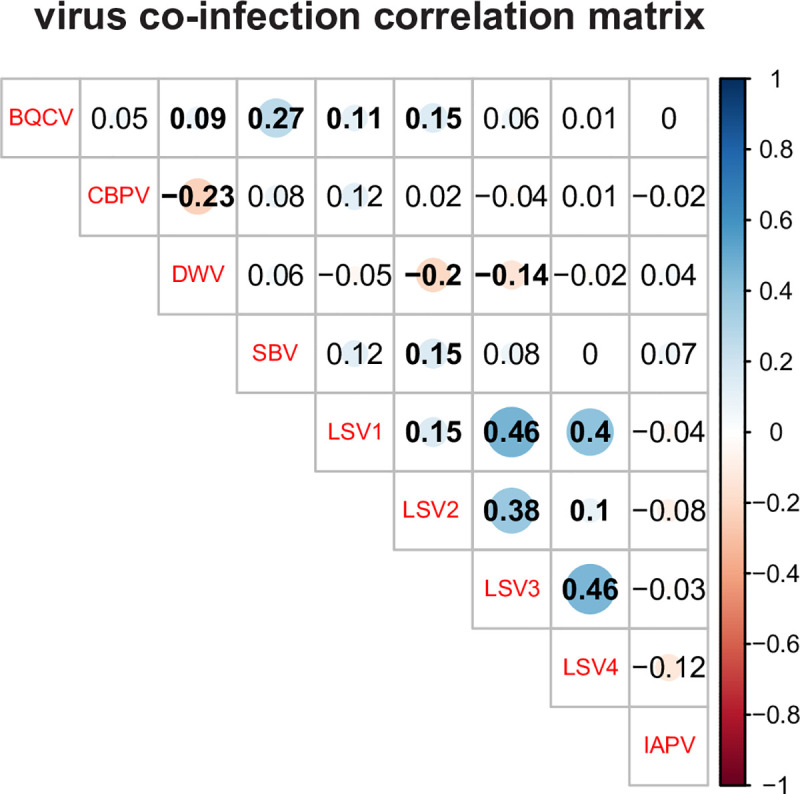
Fig 11. Virus co-infection correlation matrix.

The abundance of viruses in co-infected colonies was analyzed by calculating the correlation coefficients for each pair-wise comparison, which are listed in each cell. Correlation coefficients (reported as r values) quantify the strength and direction of the changes in pathogen abundance between co-occurring pathogen pairs. The shaded red circles represent negative correlations and blue circles represent positive correlations, darker hues and larger circles indicate stronger correlations, and bold numbers indicate significant correlations (p-value < 0.05). In this sample cohort, the Lake Sinai viruses had the strongest positive correlations.
