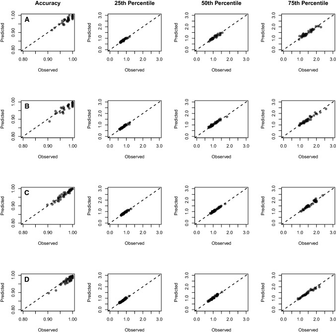
Fig. 13.
Graphical representation of the diffusion model fit to the “WM” data set. Each plot shows the observed data for each participant (each circle) plotted against the predicted data for the model for the Accuracy (1st column) and for the 25th, 50th, and 75th percentile of the response time distributions (columns 2–4) for four conditions (Rows A–D): Row A shows the ABA response repetition condition. Row B shows the CBA response repetition condition. Row C shows the ABA response switch condition. Row D shows the CBA response switch condition. The dotted diagonal line shows the line of perfect model fit

