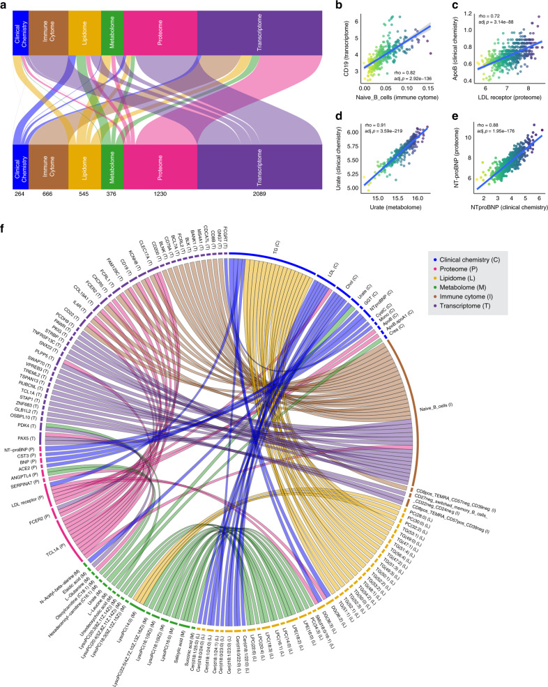
Fig. 4. Inter- and intra-omic correlation.
a Flow diagram showing the combinations of inter-omics Spearman correlations above 0.5 between the different datasets. The numbers represent the number of features correlating between two datasets. Selected examples of highly correlated variables between two datasets using spearman correlation: b CD19 and naïve B cells, c ApoB and LDL receptor, d Urate, and e NTproBNP. f Chord diagram of the top 20 inter-omic Spearman correlations for each of the datasets. The ribbon thickness reflects the spearman correlation. Multiple test corrections have been applied for p values using Benjamini and Hochberg method.

