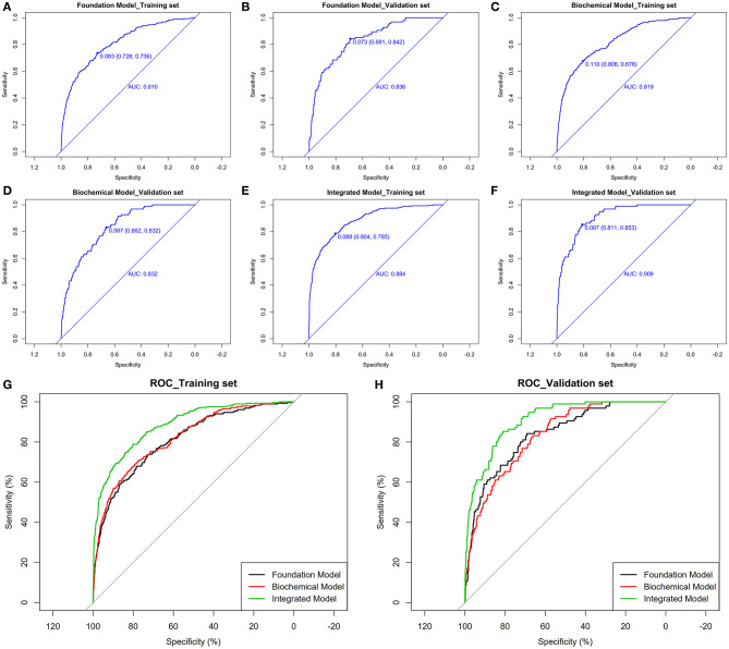
Figure 3.
The pooled AUC of the ROC curve in training set and validation set. Foundation model (A,B), biochemical model (C,D), integrated model (E,F): The y axis measures the net benefit. The dotted line represents the stroke incidence risk nomogram for T2DM patients. The thin solid line represents the assumption that all patients are diagnosed as stroke. The thick solid line represents the assumption that no patients are diagnosed as stroke. (G,H): Integration of above decision curve analysis for the stroke incidence risk nomogram based on three models in training set and validation set.

