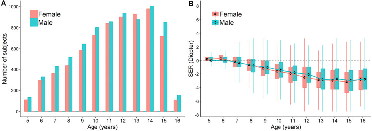
Fig. 1.
Data Distribution. The distribution of the number of subjects (a) and SER (b) across ages. Boxplots show mean value (round dot), median (horizontal line), 25th and 75th percentile, maximum and minimum values for each group. The mean values are connected to show the trend of SER change with development. No statistical significance is found in any of the age between genders (Student's t test). See statistics for comparison between each age group in Supplementary Table 5

