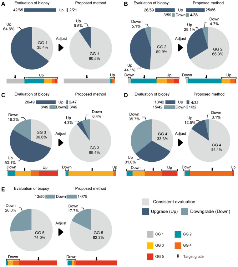
Figure 5.
Comparison between our method and GG-NB at each grade. (A) Grade 1 of GG-RP. (B) Grade 2 of GG-RP. (C) Grade 3 of GG-RP. (D) Grade 4 of GG-RP. (E) Grade 5 of GG-RP. The upper bar chart and ratio at the top indicate the number of people who were upgraded or downgraded in the dataset. The color bar represents the detailed type of upgrading and downgrading group. The black arrow indicates the target of the GG-RP corresponding to the pie chart.

