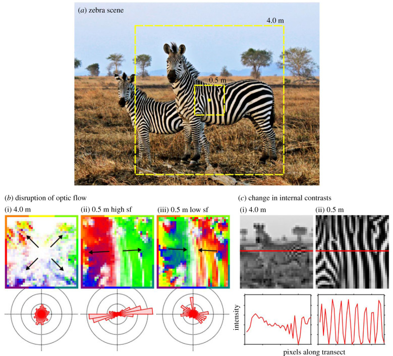
Figure 1.
Illustration of the main test hypotheses. (a) Zebra scene (Wikimedia Commons). Dashed squares illustrate horsefly views chosen at 4.0 m and 0.5 m distances. Yellow star illustrates a fictive landing site towards which a virtual fly is heading. (b) Motion maps generated from the same down-sampled images expanding from the central landing point. Colour encodes motion direction (according to the surrounding border scale) and saturation encodes motion strength at (i) 4.0 m illustrating typical optic flow, (ii) 0.5 m with high spatial sample frequency (sf) illustrating the aperture effect, and (iii) at 0.5 m with low spatial sample frequency illustrating spatio-temporal aliasing. The distribution of motion vectors across each of these scenes is represented in the polar histograms below. (c) Scene at the two viewing distances down-sampled to approximate tabanid visual resolution (0.5 cycles/°). Horizontal red line indicates an image transect, the intensity values of which are plotted below.

