Figure 3.
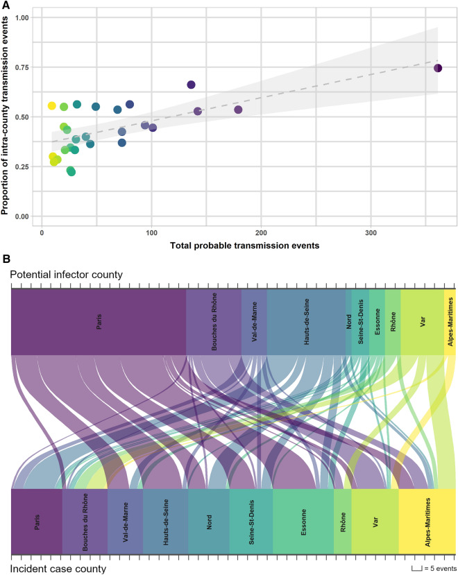
Inter and intra-county probable transmission events, 2013–2015. (A) For each county, the total number of pairwise episodes or “probable transmission events” for the 2013–2015 period were compared to the proportion of these events that occurred within the same county. A simple linear regression model with 95% confidence intervals is shown. Colors represent individual counties from largest number of total events (purple) to least (yellow). (B) The Senkey diagram shows the number of linked events between the counties of the potential infector and the counties of the incident episodes. To reduce noise, we limited our observations to only the inter-county links of ten counties with the highest number of total probable transmission events.

