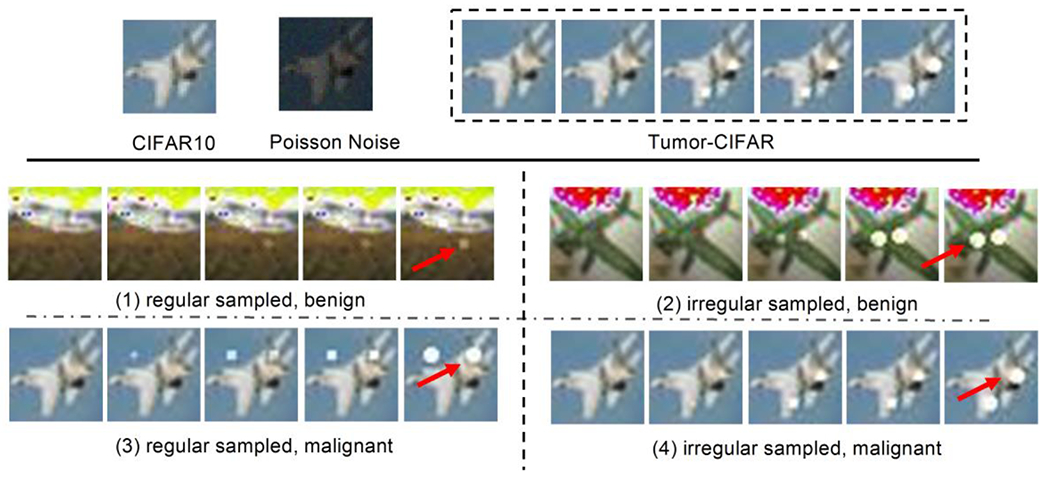
Fig. 3.

Illustration of the Tumor-CIFAR. The upper panel shows the differences between CIFAR10 and Tumor-CIFAR. Each image in CIFAR10 will be transformed into a five-step longitudinal sample by adding growing nodules and Poisson noise (the intensities of noise map in the figure are magnified ten times for better visualization). The bottom panel show more examples in the two version datasets we simulated (e.g., nodules are added to ‘airplane’). The bottom-left panel is from version 1, which has the same time interval distribution, different nodule sizes between benign and malignant. The bottom-right panel is from version 2, which has the same nodule size distribution, different time intenvals between benign and malignant, the dummy nodules are shown as white blobs (some are indicated by red arrows).
