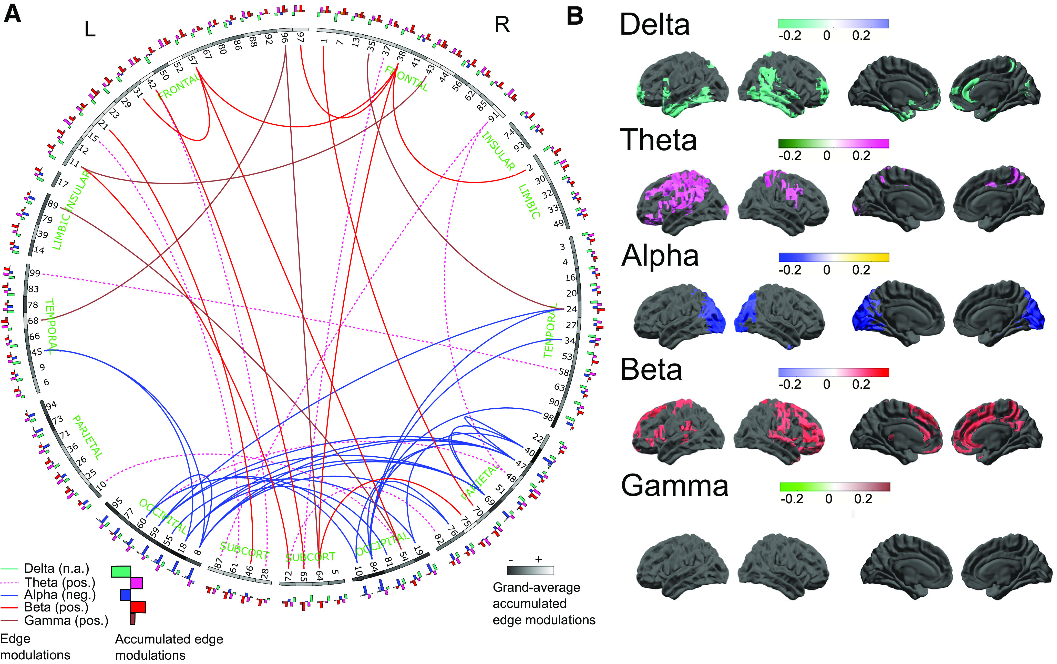
Figure 3.

A, Connectogram-style visualization (Irimia et al., 2012) of the MCC edges presented in Figure 2. This figure shows the top 50 MCC edges (i.e., the top 50 positive and negative edges, respectively), across all five frequency bands (globally tresholded across all bands pooled). Nodes are represented on the outside of the ring, in an approximately anatomically-faithful anterior-posterior and left-right arrangement. Anatomically labeled parcel identities are listed in Extended Data Figure 1-2. Each parcel’s grayscale value indicates its average relationship to the CCA mode, i.e., its average accumulated MCC values across frequency bands, white indicates a positive relationship to the mode, and black indicates a negative relationship (averaged over bands and all edges, i.e., connections of that parcel). The five-band histograms on the outer ring indicate the band-specific accumulated MCC values for each node (same color coding as for the top edges in Fig. 1A and the maps in Fig. 1B, histograms pointing outwards are positive, inward histograms indicate negative accumulated MCC values). B, Maps of accumulated MCC values for all frequency bands. These represent the average MCC values, over all connections, for each parcel. Thus, these accumulated maps represent the overall involvement of each parcel in predicting behavior and provide complementary information to the MCC edges by showing the presence of connectivity foci, i.e., nodes of particular importance to the MCC network, acting as sinks or hubs. Thresholded at the 10th and 90th percentiles for negative and positive accumulated MCC values, respectively. NB, no suprathreshold accumulated MCC values are observed in the γ-band. L = left; R = right; pos. = positive; neg. = negative; SUBCORT = subcortical.
