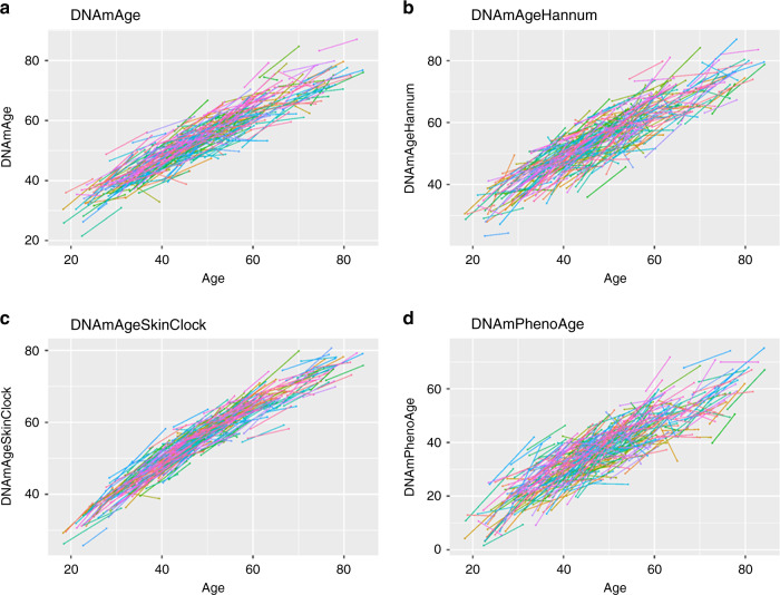
Fig. 2. Spaghetti plots of DNA methylation age versus chronological ages in the longitudinal Enroll-HD data 2.
Each spaghetti plot depicts DNAm age versus chronological age, using the Enroll-HD data 2 with two time-points per individual. Each line connects two blood draws from the same individual collected on average 7.9 years apart. The panels report results for different epigenetic clocks a Horvath’s pan-tissue clock14, b Hannum’s blood-based clock15, c the skin and blood clock16, and d and DNAm PhenoAge17. The same analysis was not performed on DNAmGrimAge because it is a mortality risk predictor that uses age in its definition.

