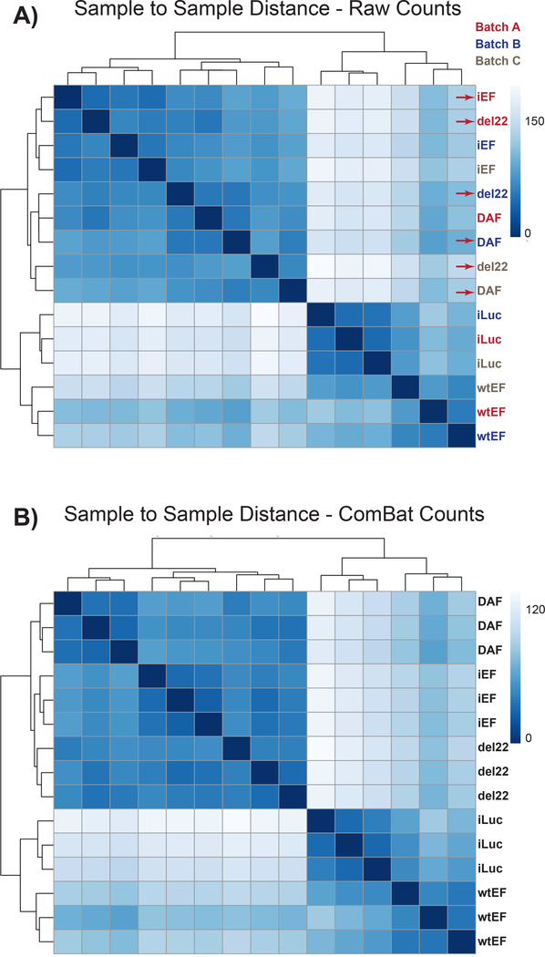
Figure 4: Sample-to-sample distance heatmaps:
(A) Sample-to-sample distance plot showing the sample clustering of the raw count data. Samples which are clustering both by batch and by sample are denoted with red arrows. (B) Sample-to-sample distance plot following batch normalization with ComBat. Here, samples from all replicates cluster together, independent of batch.

