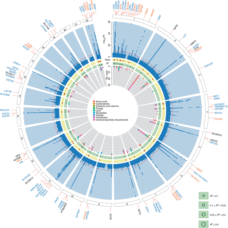
Fig. 1. Circular presentation of 240 identified loci associated with metabolite concentrations in urine.
The −log10(P) for genetic association with metabolite concentrations by chromosomal position is shown by the light blue band. Chromosomes are indicated by numbered panels 1–22. Associations of all 1,172 metabolites, shown in dark blue, are overlaid in the light blue band, are based on linear regressions, and association P values are capped at 1×10−60. The red line indicates genome-wide significance (P = 4.3 × 10⁻¹¹). For details about significant association s see Supplementary Table 3. Genetic regions that were identified in previous mGWAS of urine are shown by gene labels in black, genetic regions that were not identified in previous mGWAS of urine are shown by gene labels in blue, and genetic regions that have not yet been identified in any queried mGWAS are shown by gene labels in orange. The presence of significantly associated metabolite ratios in the genetic region are shown by dark red dots in the yellow band. The light green band shows the maximum variance in metabolite levels that was explained by the index SNP of each genetic region using dark green circles; the size of circles reflects different ranges of explained variance. A stacked representation of the number of associated metabolites in each genetic region, colored according to the super-pathways to which they belong, is shown by the inner gray band. Color keys that represent metabolite super-pathways are shown in the middle.

