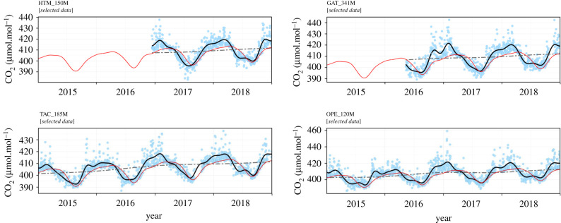
Figure 3.
CO2 time series observed at Hyltemossa (HTM, Sweden), Gartow (GAT, Germany), Tacolneston (TAC, UK) and Observatoire Pérenne de l'Environnement (OPE, France). Each blue dot corresponds to a daily average, after data selection as described in the main text. The black curve shows the smoothed curve of these points, and the dash-dot line the long-term trends. The red curve represents the smooth curve of the CO2 time series at Mace Head, Ireland, in the marine sector. (Online version in colour.)

