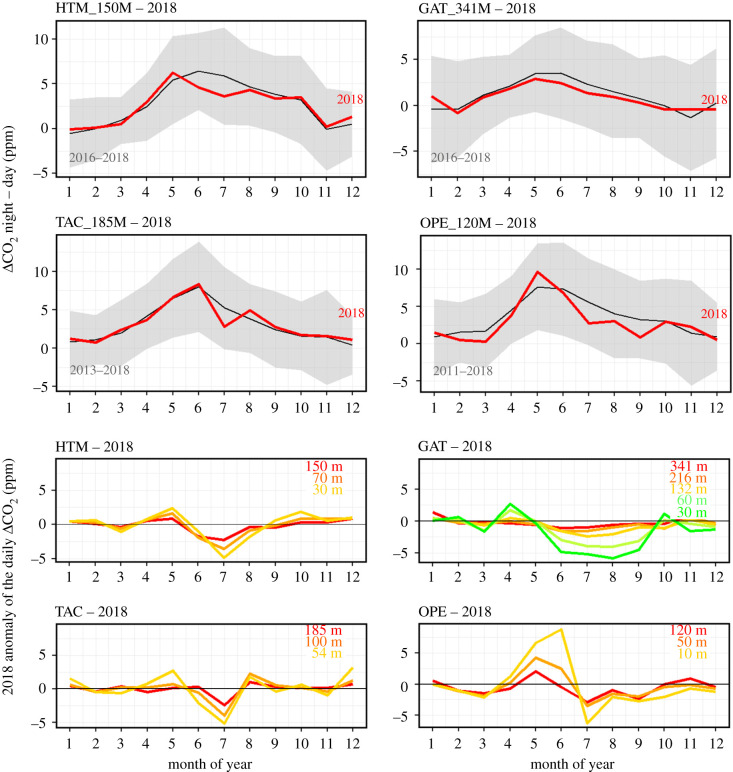
Figure 6.
The top panel shows, at four tall towers (highest levels), the amplitude of the CO2 daily cycles averaged every month for all available years (black line and grey area), and for 2018 (red line). The bottom panel shows, for the same sites, the differences of CO2 daily cycles between 2018 and the average over all available years. The colours represent the different sampling levels at the towers (red curves correspond to the top panel figures). (Online version in colour.)

