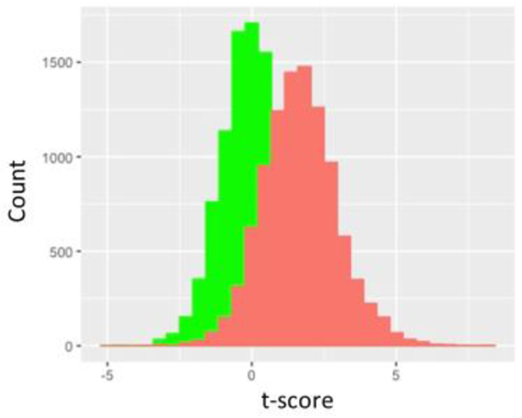
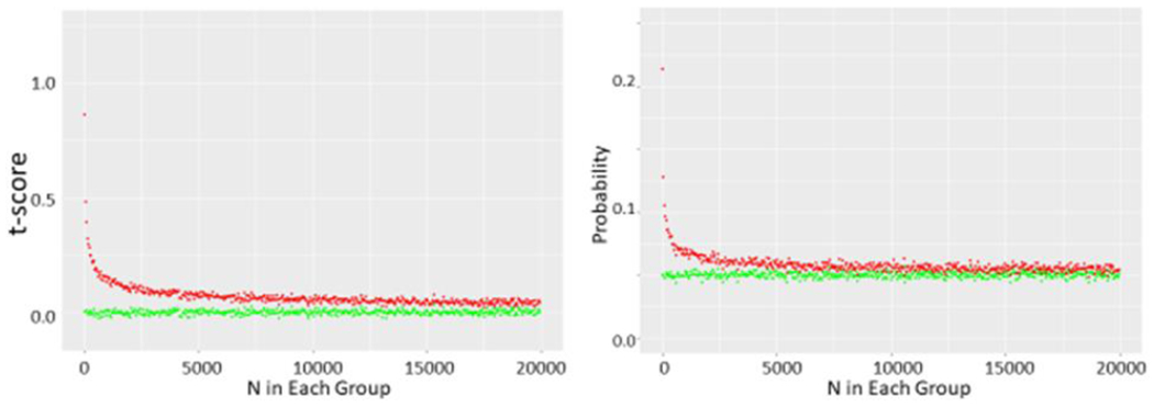
Figure 2.


a shows green histogram for 10,000 t-scores determined by drawing two N=10 samples from a normal distribution with mean of 1 and SD of 1. Red histogram is also 10,000 t-scores determined by these same pairs of N=10 samples from same underlying distribution except highest value of one sampling and lowest value of the other sampling are systematically eliminated.
b shows t scores and corresponding p values obtained from running 10,000 t-tests on N samples drawn from this same normal distribution and corresponding p values where N ranges from 5 to 25. Green circles represent unmodified pairs of samples whereas red circles represent sets where top value of one and bottom value of other sample are dropped.
c shows data obtained as N ranges from 10 to 20,000 in each set.
