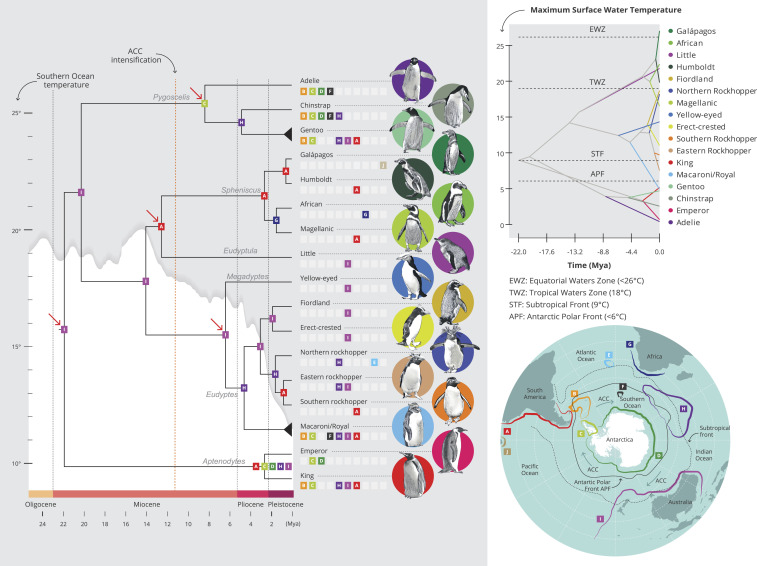
Fig. 1.
Evolutionary history of penguins. Phylogenetic hypothesis of penguin species and divergence time estimates using the UCE dataset. Red arrows represent the four fossil calibration points. The fifth point corresponds to the outgroup node, which is not shown in this figure (see SI Appendix, Fig. S10). Each node is represented by the ancestral distribution before the cladogenesis event using ancestral range reconstruction based on the best-fitting model (DIVALIKE+J) and is associated with one or more of the 10 geographic locations depicted in the map at the bottom right (letters A to J and color codes); areas at branch tips represent the current range of species. Past temperature of the Southern Ocean is represented by the white graph behind the phylogeny (22, 23); onset of the strengthening of the ACC, by the dashed red line (24, 25). (Top Right) Ecological niche disparity through time (DTT) for penguins, with the phylogeny projected onto niche parameter space on the y-axis (maximum surface water temperature) with predicted niche occupancy (PNO) over time (x-axis) reconstructed for internal nodes.

