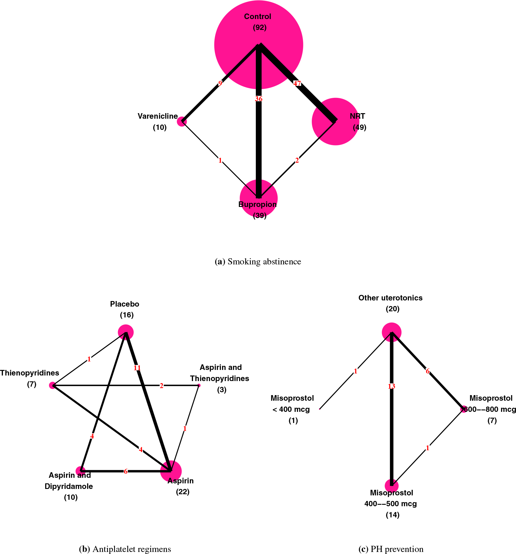
FIGURE 2.

Network plots of the three example datasets. Each node in a plot stands for a treatment and each edge represents a direct comparison between two treatments. Vertex size is proportional to the number (in parenthesis) of direct comparisons containing that treatment; edge thickness is proportional to the number (in red) of direct comparisons.
