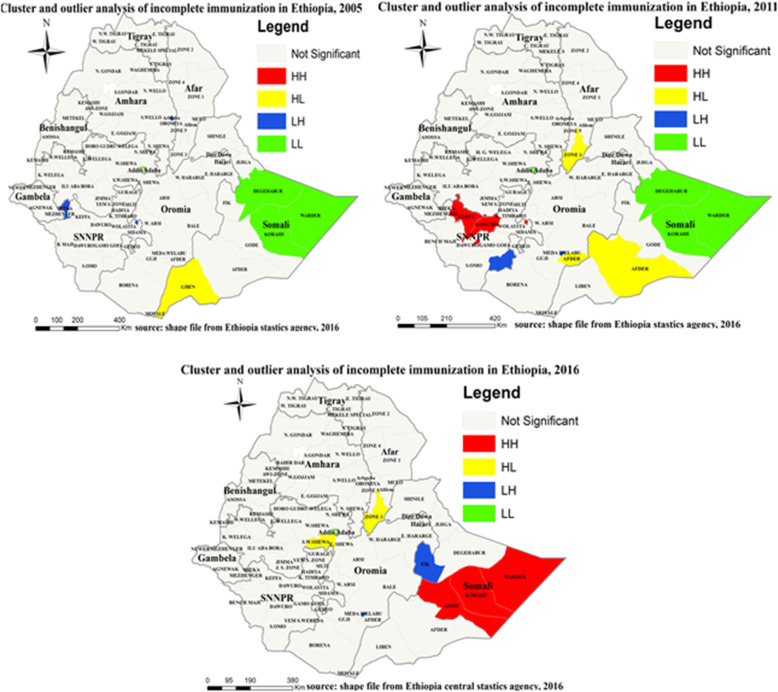
Fig. 6.
Cluster and outlier analysis of incomplete immunization in Ethiopia, EDHS 2005, 2011 and 2016. Local Moran’s I analysis result of incomplete immunization in Ethiopia from Ethiopian demographic and health survey. The right panel represents for 2005 EDHS, and the left panel represents for 2011 EDHS the right bottom panel represents for 2016 EDHS. In the figure the red color indicates high clustering, the yellow color indicates high outlier clustering, the blue color indicates low outlier clustering, and the green color indicates low clustering the fogy color indicates insignificant clustering. The thick white black line indicates regional borders while the thin white black line indicates zonal borders. [Shape file source: (CSA, 2013; URL: https://africaopendata.org/dataset/ethiopia-shapefiles); Map output: Own analysis using ArcGIS 10.7 Software]

