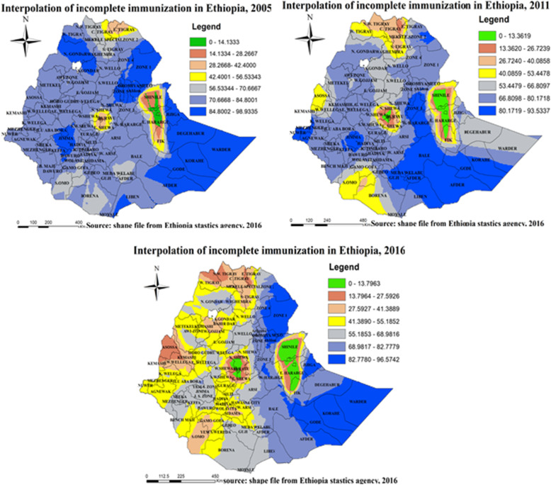
Fig. 8.
Spatial interpolation of incomplete immunization in Ethiopia, EDHS 2005, 2011 and 2016. Kriging interpolation analysis result of incomplete immunization in Ethiopia from Ethiopian demographic and health survey. The right panel represents for 2005 EDHS, and the left panel represents for 2011 EDHS the right bottom panel represents for 2016 EDHS. In the figure the blue, bright blue, bright black color indicates high risk zones depending on its intensity, the yellow color indicates moderate risk, and the green, gray, bright color indicates low risk zones of incomplete immunization in Ethiopia. The thin black line indicates zonal borders. [Shape file source: (CSA, 2013; URL: https://africaopendata.org/dataset/ethiopia-shapefiles); Map output: Own analysis using ArcGIS 10.7 Software]

