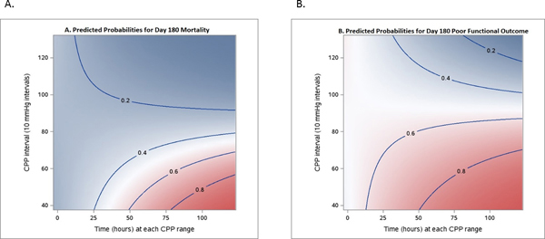
Figure 2.

Visualization of correlation between outcomes and average time at observed CPP threshold levels. A, Day 180 mortality (n = 499). B, Day 180 poor mRS (n = 499). Each color-coded point in the graph refers to a probability of the outcome, defined by a certain CPP threshold (Y-axis), and a certain duration (X-axis). Dark pink/blue areas mean that such CPP events, on average, are associated with higher probability of worse outcome (or death)/good outcome (mRS 4–6/0–3).
