
Figure 2.
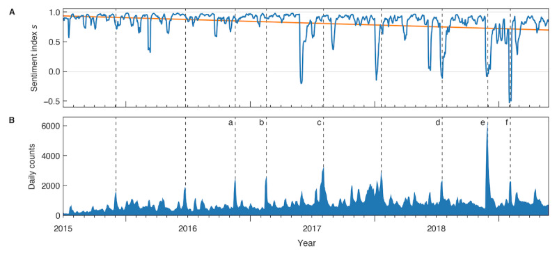
A) Predicted sentiment towards CRISPR between July 2015 and June 2019. The blue curve denotes the sentiment s, which is calculated as the mean of the weighted counts of positive and negative tweets over a centered rolling window of 7 days. The orange curve denotes a linear fit of the sentiment s. B) Daily counts of all analyzed tweets. The blue area shows the daily sum of positive, negative, and neutral tweets as the mean within a 7-day centered rolling window. All peaks above a relative prominence of 0.2 are marked with dashed lines; a-f denote peaks that coincide with certain events.