
Figure 3.
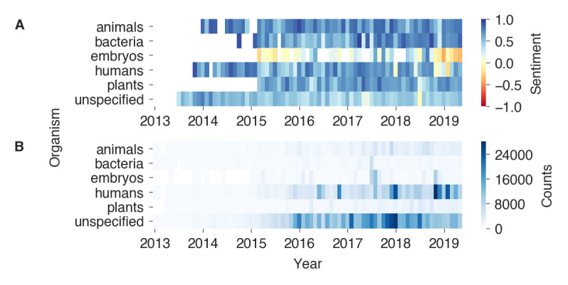
A) Heatmap of monthly sentiments by predicted organism. The sentiments were calculated as the mean of the weighted counts by sentiment (the weights included −1, 0, and 1 for negative, neutral, and positive tweets, respectively) for each month and organism class. Blue and red colors indicate positive and negative sentiment values, respectively. The sentiments of heatmap cells with <100 tweets of that month and organism are transparent. B) Monthly counts by predicted organism.