
Figure 4.
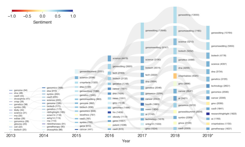
Visualization of the sentiment associated with the most frequently used hashtags every year. For every year, the 15 hashtags with the highest counts for that year are included (the hashtag #crispr was excluded). The hashtags are sorted by yearly counts (indicated by the bar height), where the hashtag with the highest count is at the top. The color represents the average sentiment for the respective hashtag, with blue representing a very positive sentiment and red representing a very negative sentiment. If a hashtag is listed in multiple years, the occurrences are linked with a gray band. The number of tweets with the hashtag is indicated in parentheses next to the respective hashtag. For the year 2019, the counts were extrapolated from the months before June to the full year.