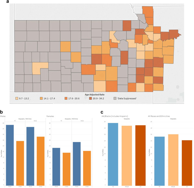
Figure 6.

(A) The University of Kansas Cancer Center catchment area counties’ heat map representing the mortality rates of colorectal cancer. Colorectal cancer mortality data was suppressed in 72 counties, all of which had populations <34 000. (B) The University of Kansas Cancer Center catchment area average standard rate capturing the mortality rates of colorectal cancer comparing rural versus urban. (C) The University of Kansas Cancer Center catchment area average standard rate capturing the mortality rates of colorectal cancer comparing African American versus all the other races.
