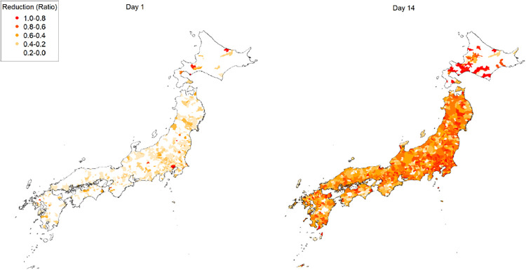
Fig 2. Temporal and geographical visualizations of the reduction in production.
The left and right panels show the first day and the first 2 weeks of the lockdown, respectively. The reductions are aggregated and averaged over firms in municipalities. The red areas, for example, indicate firms in the areas whose actual production is substantially (more than 80%) smaller than their capacity before the lockdown on average.

