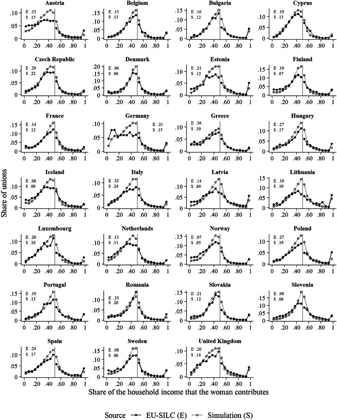
Fig. 4.
Comparison of the relative income distributions observed in the EU-SILC data with those generated by the simulation model. Note: The grey vertical line indicates the point where the share of the household income that the woman provides is .5. The numbers in the upper left/right corner of each panel show the shares of couples in which the woman contributes nothing to the household income.
Source: The simulation results are based on the main simulation experiment. The empirical data are the same as for Fig. 1

