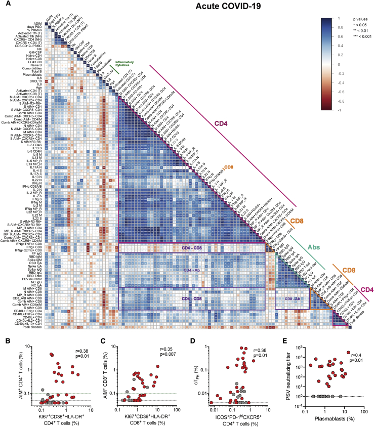
Figure 5.
Associations of Adaptive Immune Response Features with COVID-19 Severity
(A) Correlogram of acute COVID-19 donors. Spearman rank order correlation values (r) are shown from red (−1.0) to blue (1.0); r values are indicated by color and square size. Blank fields with black dots indicate lack of signal. p values are indicated by white asterisks. The teal triangle denotes SARS-CoV-2 antibody features, magenta triangle denotes SARS-CoV-2-specific CD4+ T cells features, and orange triangle denotes SARS-CoV-2-specific CD8+ T cell features. Purple rectangles denote coordinated adaptive immune response features. The dark green line denotes select inflammatory cytokines. Peak COVID-19 disease severity (“Peak disease”) is the bottom row. Additional information on feature names are described in the STAR Methods.
(B) Correlation of Ki67+CD38+HLA-DR+ CD4+ T cells (as percentage of total CD4+ T cells) with SARS-CoV-2-specific (combined AIM+) CD4+ T cells.
(C) Correlation of Ki67+CD38+HLA-DR+ CD8+ T cells (as percentage of total CD8+ T cells) with SARS-CoV-2-specific (combined AIM+) CD8+ T cells.
(D) Correlation of activated (ICOS+PD-1hi) TFH cells (as percentage of total CD4+ T cells) with SARS-CoV-2-specific (combined AIM+) TFH (CXCR5+CD4+) cells.
(E) Correlation of SARS-CoV-2 PSV-neutralizing antibody titer and percentage plasmablasts (CD38hiCD20- of CD19+ B cells). Unexposed controls (n = 15), acute COVID-19 (n = 26) displayed. Statistics reported for (B–E) are reported for unexposed and acute donors. The black dotted line indicates LOD; the green dotted line demarcates marginal responses as determined by unexposed donor responses.
∗p < 0.05, ∗∗p < 0.01, ∗∗∗p < 0.001. See also Figure S5, Table S3, and Data S1.

