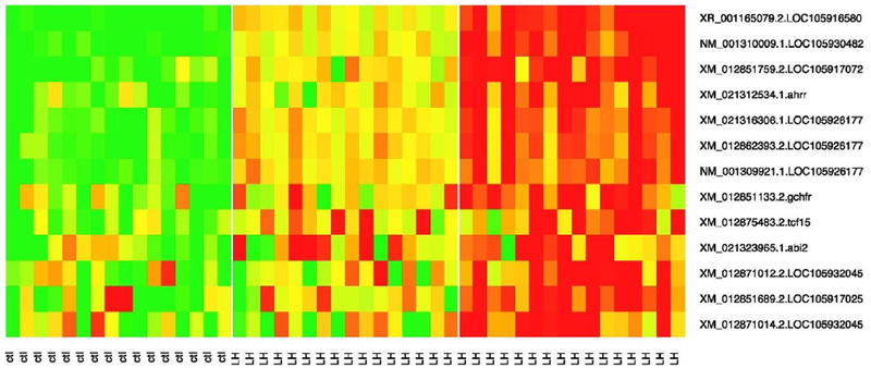
Fig. 2.

Gene expression level heat map of top 13 differentially expressed transcripts. in the heatmap plot, each column stands for an experimental sample, and each row stands for a transcript as annotated on the right size The left pane, consisting of the first 16 samples, is of the control group, the middle pane of the next 16 samples is of TBPH_LOW group, and the right pane of the remaining 16 samples is of TBPH_HIGH group. In the row label, ctl stands for the control group, while LH is for the combined TBPH_LOW and TBPH_HIGH group. The head map colors indicate relative expression level with green representing the lowest expression, and red for the highest expression level. The plot clearly shows dose-dependent response of these genes with increasing expression level from the control, TBPH_LOW, and TBPH_HIGH.
