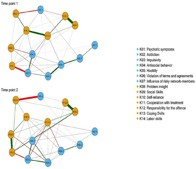
Figure 1.
Network structure of clinical risk and protective factors at admission (T1) and discharge (T2).
Note. Orange circles refer to protective factors and blue circles refer to risk factors. Green lines indicate positive associations and red lines indicate negative associations. The thicker the line, the stronger the association between two nodes is.

