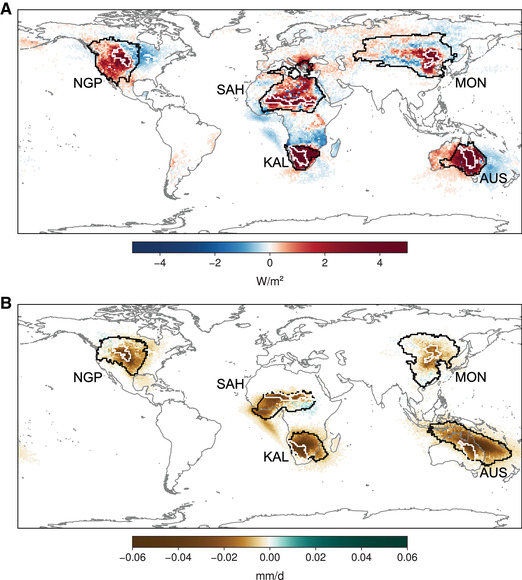
Figure 4.

Anomalies in heat and moisture contributions during low‐GPP years. (A) Advected heat to our five ecoregions (white contours), expressed as anomalies for the respective peak month (Fig. 2B and Fig. S1, online only) and the two antecedent months. The climatological mean source regions are delineated using black contours, such that 80% of the average advected heat is accounted for by the smallest possible selection of source pixels. (B) Like panel A, but for advected moisture.
