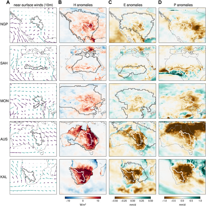
Figure 5.

Winds and surface fluxes during low‐GPP years. (A) Mean near‐surface winds (ERA‐Interim) during low‐GPP seasons, colored green (purple) when mean wind speeds are higher (lower) than the climatology. (B) Surface sensible heat flux anomalies. (C) Evaporation anomalies. (D) Precipitation anomalies. In all plots, ecoregions are indicated by dark (A) or white (B–D) contours; for panels B and C, climatologically advected heat and moisture source regions are visualized by dark contours (as in Fig. 4), defined so that 80% of the average advected heat or moisture is explained by the lowest possible number of source pixels. Oceanic surface fluxes were bilinearly interpolated to match the native 0.25 × 0.25° horizontal resolution of terrestrial data used here.
