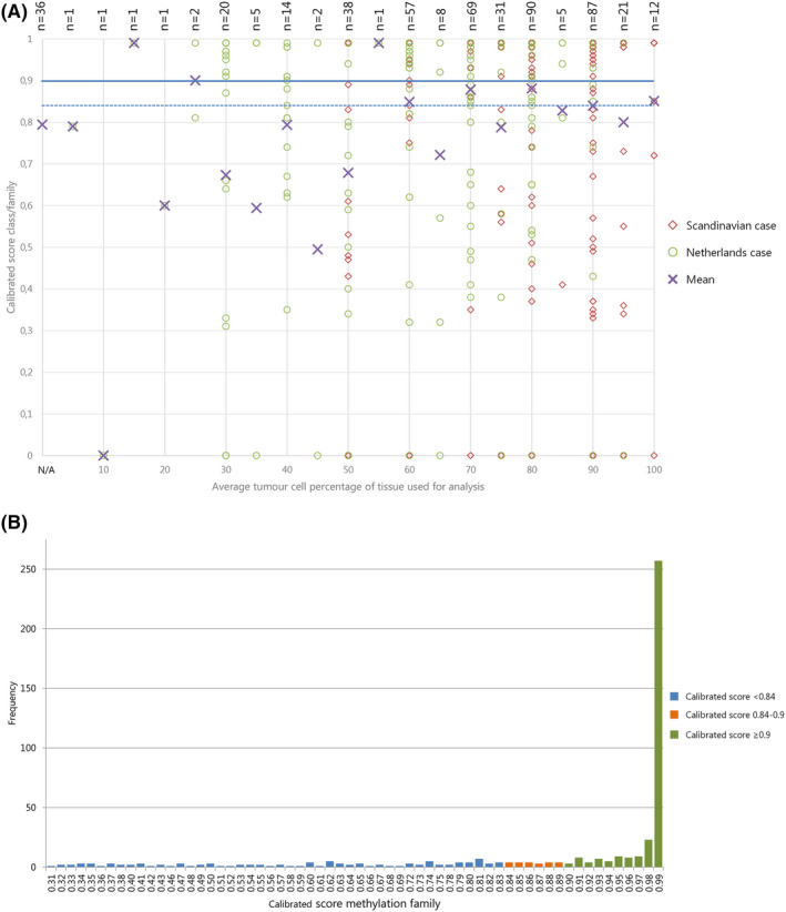
Figure 1.

(A) Effect of estimated tumour cell percentage on calibrated score: Scatter plot of average tumour cell percentage (x‐axis) versus calibrated score for MP class family (Y‐axis). Cases from NL: green circles; cases from Scandinavia: red diamonds; purple crosses: mean. Horizontal lines: blue solid ‐ threshold of calibrated score ≥0.9; blue dashed ‐possible alternative threshold for calibrated score at ≥0.84 as suggested by [6] Cases with ‘no match <0.3’ (no calibrated score provided) were given the value 0 to be able to visualize them in this plot. The mean calibrated score of samples for which no tumour cell percentage was available is plotted at the bottom of the x‐axis, marked with ‘N/A’. NB. Symbols are often superimposed; labels at the top show the number of plotted cases. (B) Distribution of cases by calibrated scores for methylation class family: bar chart showing frequency of cases (Y‐axis) with specified calibrated score (X‐axis) for 468 cases with MP result. Valid matches with calibrated score ≥0.9 presented in green; no match cases with calibrated scores 0.84‐<0.9 in orange, remaining no match cases with calibrated scores 0.31‐<0.84 in blue. Data on no match cases with scores < 0.3 are not shown.
