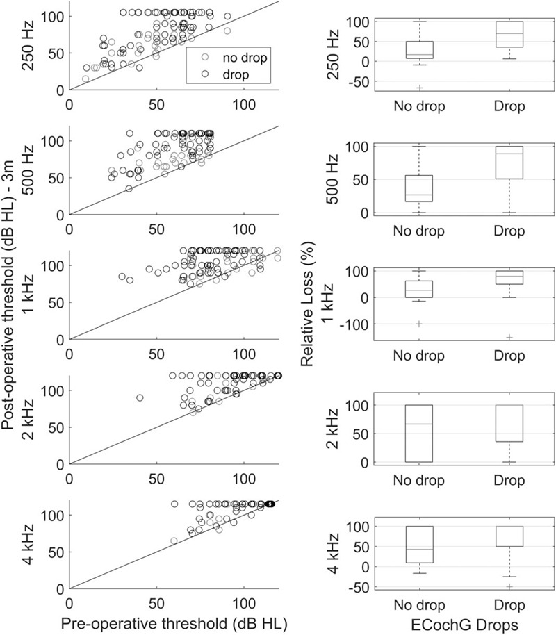
FIG. 3.

A to E, Preoperative plotted against 3-month postoperative audiometric thresholds. Data at each frequency is plotted on different rows. Red symbols are from patients who did not experience an ECochG drop, while black symbols are from patients who do exhibit a drop. The right column presents the relative hearing loss (%) at each frequency. These boxplots present median (red line), the interquartile range, with whiskers reflecting the range. Outliers are presented as red crosses. Improved hearing will have a negative value.
