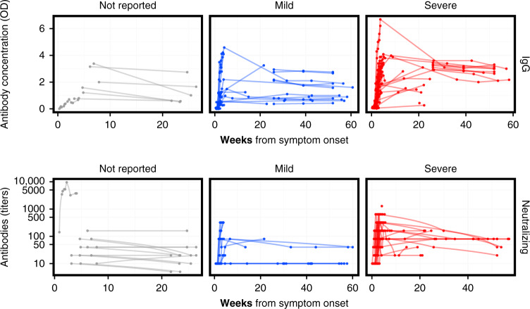
Fig. 3. MERS-CoV antibody kinetics.
The top row shows the data for studies reporting IgG concentration in units of optical density, while the bottom row shows the data for studies reporting neutralizing antibodies in units of titers. The columns correspond to different severity categories. Each line corresponds to time series for an individual patient. Some studies reported titers that were lower than or greater than some threshold value; those are here plotted at those values (e.g., for ≥320, the value is assumed to be 320). Some studies may report the kinetics of different antibodies or using different assays (and different units) for the same patient. Note that while these are plotted on the same axis, values may not necessarily be comparable across studies within each panel, as each lab may have different assay conditions resulting in different scales. See Supplementary Figs. 3 and 4 for (more limited) the data on SARS-CoV and IgA. Colors reflect the severity categories: not reported (gray), mild (blue), and severe (red).

