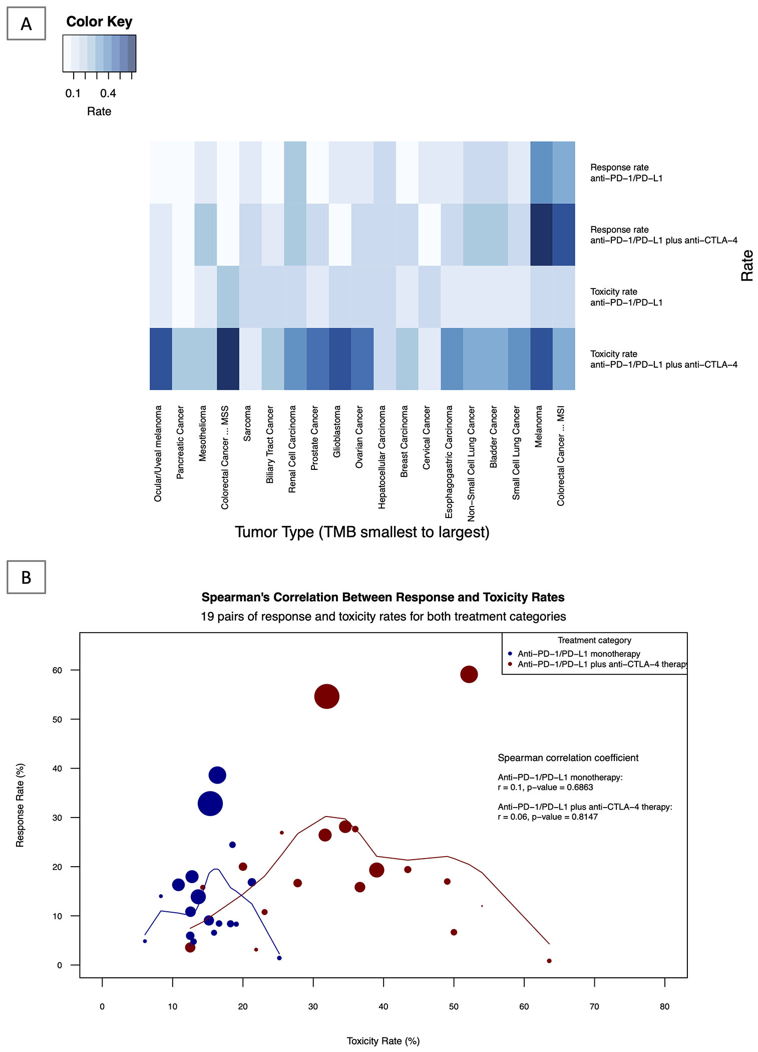
Figure 5: Heatmap and Correlative Analysis of Response and Toxicity: Single and Dual ICI therapy.

5A: Response and Toxicity Rates by Treatment Group and Tumor Type: Heatmap Analysis Shown above is the graphical heatmap representation of response and toxicity rates of 19 tumor types for which both toxicity and response data was available for both anti-PD(L)1 monotherapy and anti-PD(L)1 plus anti-CTLA-4 combination ICI therapy. Darker shading represents a higher rate of toxicity and response, whereas lighter shading indicates a lower rate of toxicity and response. eTable 3 in the Supplement shows individual data for each tumor type, including median TMB, ORR and toxicity rates.
5B: Correlative Analysis of Response and Toxicity Rates of Single vs Dual ICI therapy across 19 tumor types.
The above figure represents the Spearman’s correlation between response rate (y-axis) and toxicity rate (x-axis) of both anti-PD(L)1 monotherapy (blue line) and anti-PD(L)1 plus anti-CTLA-4 therapy (red line). The circles represent individual tumor types and varying sizes of circle represent the value of TMB, which the size of the circle is proportional to the value of TMB (higher TMB equates to larger circle). Loess smoothing curve with the default span of 0.75 is shown.
