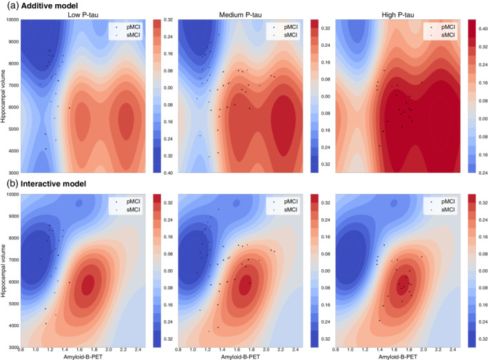
FIGURE 3.

Contour plots for Model 3: Two‐way interaction between amyloid‐β‐PET and hippocampal volume, stratified by P‐tau. Contour plots illustrate the decision boundaries for different classification models (Data based on Model 3). Positive values (red contours) indicate regions where the probability of being classified as progressive MCI is increased; negative values (blue contours) where that probability is decreased. Scatterplots of amyloid‐β‐PET (x‐axis) and hippocampal volume (y‐axis) are overlaid (crosses = stable MCI, dots = progressive MCI), with each column representing a tertiary split of participants based on P‐tau values (<22.22 = low P‐tau, 22.22–36.25 = medium P‐tau; >36.25 = high P‐tau). (a) Additive model: illustrates the dynamics of the additive model across the three P‐tau ranges. (b): Two‐way interaction model, using univariate and bivariate kernels. Comparison of the first row (additive model) and second row (interactive model) conveys the influence of incorporating nonlinear interaction kernels on the biomarker space
