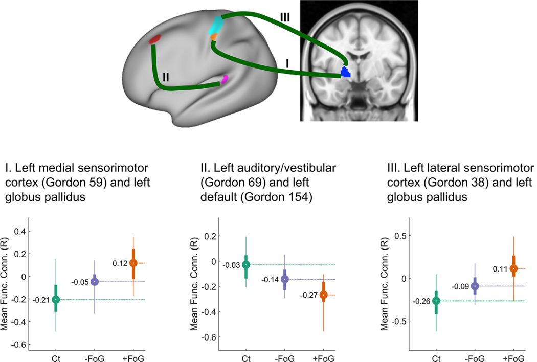
Fig. 2.
Connections with significant differences among the freezers (Ct), nonfreezers (PD − FoG) and freezers (PD + FoG) groups. Top panel figure shows the location of three pairs of functionally connected areas (I, II and III) with significant differences in functional connectivity among groups on a “very-inflated” map of the left cortex. Bottom-panel figures show the distribution of the mean functional connectivity values for each ROI pair, color-coded per diagnosis (Ct, PD + FoG, PD − FoG). Circles represent the mean functional connectivity and the bar indicates the interquartile range. Thin lines correspond to the percentiles 2.5–97.5.

