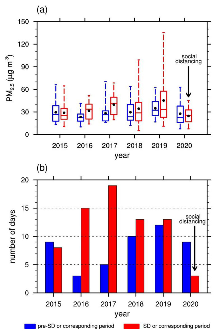
Figure 2.
(a) Box plot of the daily mean PM2.5 concentrations in the 30 days of pre-SD in 2020 and the corresponding periods in 2015–2019 (blue) and SD in 2020 and the corresponding periods in 2015–2019 (red). The box indicates the lower and upper quartiles. The center line and black dot inside each box represent the median and 30 day mean values, respectively. The whiskers above and below each box indicate the maximum and minimum values, respectively. (b) Numbers of days with “high” levels of PM2.5 concentration (>35.0 μg m−3) out of the 30 days of pre-SD in 2020 and the corresponding periods in 2015–2019 (blue) and SD in 2020 and the corresponding periods in 2015–2019 (red).

