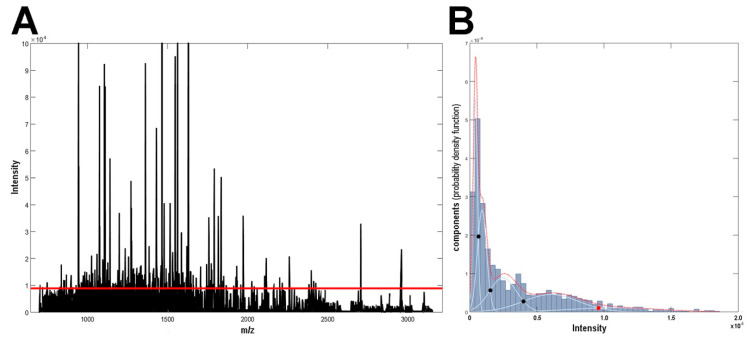
Figure 1.
Mass spectrometry imaging (MSI) spectrum. (A) The average mass spectrum. (B) Distribution of m/z components with different average intensity; the red dotted curve represents an intensity distribution model with its constituents represented by blue lines (dots represent thresholds delineating intensity-related classes of components). The red line in Panel A represents the threshold separating 147 most abundant components (>9610 a.u.).

