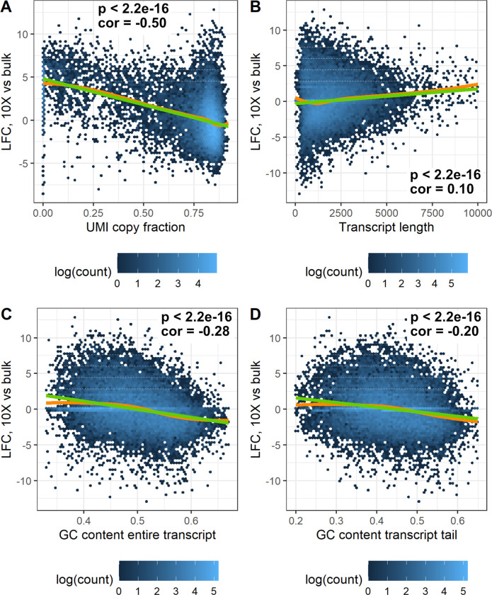
Fig 5. Log2 fold change between 10x data and bulk for each gene, plotted as a function of different covariates.
The green line represents a linear fit, whereas the orange line shows a Loess fit. The data shown is from cortex 1 of the EVAL dataset. Each plot shows the p value for the linear fit (F-test) and the Pearson correlation. A. UMI copy fraction. Only genes with more than 5 molecules available for calculating UMICF are shown. B. Transcript length. C. The GC content of the entire transcript. D. The GC content of the 150 bases closest to the transcript tail.

