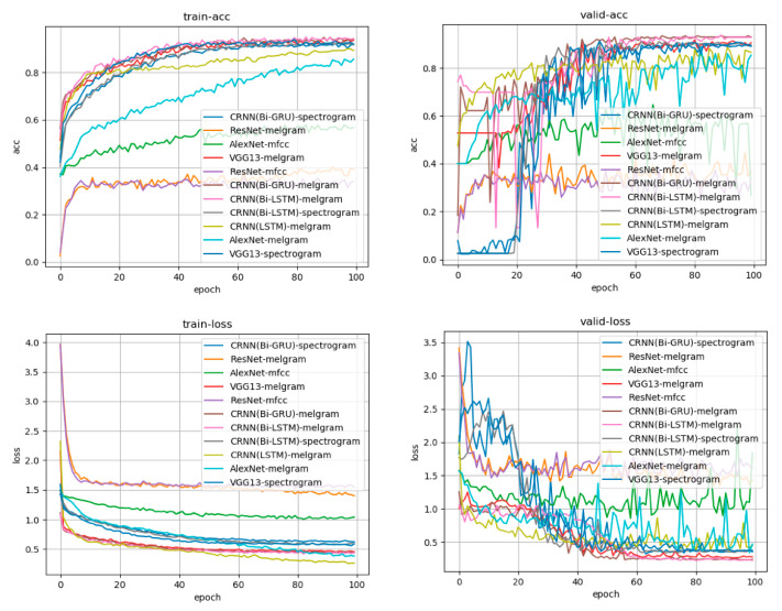
Figure 3.
Learning curve for each learning model and each input source. Accuracy is presented in the upper row, whereas the loss is in the lower row. The left side is the transition based on the training data, and the right side is the transition based on the verification data. The horizontal axis indicates the number of times of learning, and accuracy increases as learning progress. Loss represents the difference between the answer of the input data predicted by the model during the learning process (e.g., the degree of firing that is a high tone) and the teacher’s answer to the actual input data (the high tone is the correct answer). It can be observed that the difference between the answer and answer from the learning model obtained during learning has decreased. The CRNN:Bi-GRU model, which had the mel-frequency log spectrogram as input, was the learning model with good accuracy and loss in both training data and verification data.

