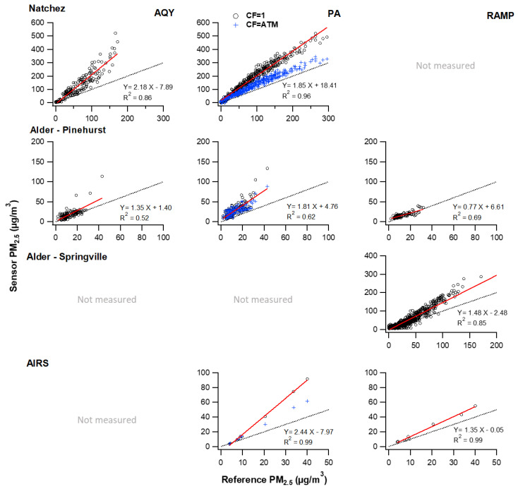
Figure 2.
Scatter plot of sensor hourly averages compared to the reference for smoke impacted times. Red lines show linear least-squares fit; black lines show a one-to-one relationship. Columns correspond to the sensor type and rows correspond to the measurement location. Note the varying concentration range measured at each location.

