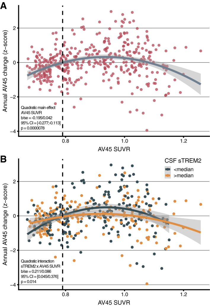
Figure 1. Association between baseline amyloid and amyloid PET change.

-
A, BRegression plot showing the association between baseline AV45 PET (x‐axis) and annual AV45 PET change (y‐axis) across the entire sample (N = 300). The vertical dashed line represents the Aβ‐positivity threshold of AV45 PET SUVR > 0.079 (A). Regression plot for the association between baseline AV45 PET and annual AV45 PET change stratified by baseline CSF sTREM2 levels (B).
Source data are available online for this figure.
