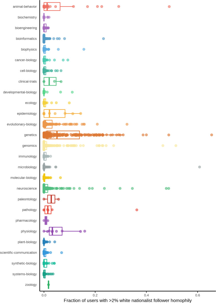
Fig 4. Distributions of white nationalist homophily by category.
Each point represents a single preprint, and the position on the y-axis indicates the proportion of users who tweeted about that preprint whose follower network homophily with the white nationalist reference panel is greater than h = 2%. Boxplots summarizing the distributions of these proportions per bioRxiv category are shown beneath each set of points. Data for the information depicted in this figure are available at https://github.com/carjed/audiences, and an interactive version of this figure can be accessed at https://carjed.github.io/audiences.

