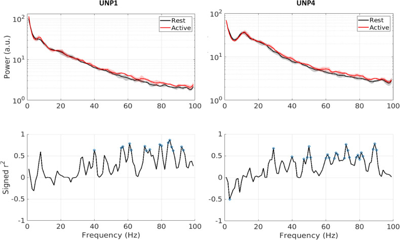
Figure 2.
Representative examples of spectral power changes during the count task. Top graphs show a spectrogram of both conditions for a representative run from each participant (red is active, black is rest). Bottom graphs show respective signed r2 values for each 1 Hz bin, with blue circles indicating significant r2 values (α = 0.05; p values not corrected). Plotted data is from week 9 (UNP1) and week 22 (UNP4). Both runs were recorded with pair e8–e10.

