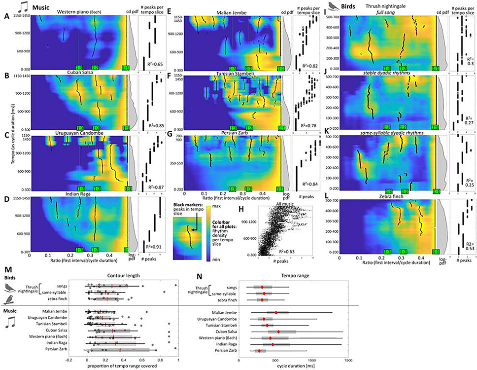
Figure 5: Probability densities of rhythms in tempo-ratio space.
Heat maps are for musical corpora (A-G), thrush nightingales (I-K), and zebra finches (L)). Probability densities are normalized per row (i.e. per tempo “slice” on the Y axes). Black markers indicate peaks in probability density. Middle panels show histograms of the tempo range abundance (same Y-axis) as log of probability density. Right panels present the number of peaks per tempo (same Y-axis as in heat maps) with coefficients of determination for number of peaks vs. tempo. Note the different y-scale between music (A-G) and birds (I-L), as birds use faster tempos. H: number of peaks vs. tempo for all musical corpora combined (peak number jittered). M: length of the peak ‘contours’ as indicated by the black markers (relative to tempo range used and shown in the heat maps). N: tempo ranges used by birdsong and music corpora as density of cycle duration [ms]. Red markers=median, gray boxes=quartiles, black lines=0.5th to 99.5th percentile.

