Figure 9.

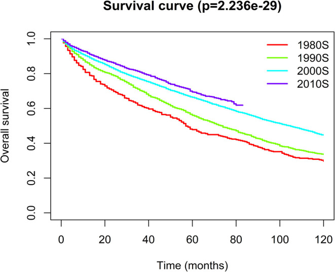
Kaplan–Meier analysis for the overall survival of Waldenström macroglobulinemia. The graph shows increasing survival from the 1980s to 2010s.

Kaplan–Meier analysis for the overall survival of Waldenström macroglobulinemia. The graph shows increasing survival from the 1980s to 2010s.